Imagine you have a problem and you’re looking for a solution. You find a business that might help, visit their website, but then leave within seconds.
On their side, you’re just another bounce in the analytics dashboard.
A high bounce rate isn’t automatically a problem. But if people are visiting your website and those visits aren’t turning into leads, it’s worth asking why.
Because oftentimes, the website itself is working against the business.
In this article, we’ll look at five things that might be causing it. Even when the business itself is awesome.
1. Your website is part of your first positive impression
Before a customer reach you out, there’s a good chance they’ve already seen your website. In those few seconds, they’re forming an impression of the business behind it.
It’s similar to social media. When people first discover you, they don’t have enough information yet, so they use whatever they can see in your profile and posts to form an impression.
And so your site. A polished, current website can quietly communicate, “This one looks good.” A neglected one can accidentally suggest the opposite.
"People DO judge a book by its cover"
What happened?
They don’t know know you deep enough. They don’t know how expert you're, that your team is excellent, or that your solutions are what they need. So they judge the cover of the book.
If it's feels outdated, confusing, or disconnected from the quality of the actual business, there’s a gap between who you are and how you’re perceived.
Perception matters here, because customers are asking something actually simpler: “Do I feel confident engaging further with this business?” Whatever perception built within this first encounter, is their truth.
2. A modern website making sure your presentation doesn’t undersell you
Visual presentation has a strange amount of power. Before people understand whether you’re good at what you do, they already have an impression of you.
A lawyer wearing a sharp suit doesn’t automatically make them a better lawyer, but it can make people feel that they’re dealing with someone capable and serious.
The same thing happens with a website. A modern, well-presented website doesn’t prove that a business is excellent. But it opens up opportunities.
Confessions of a Shopaholic
In Confessions of a Shopaholic, Rebecca Bloomwood knows how to present herself. She dresses to impress, and that presentation opens doors before people really know her story. Of course, the irony is that she’s using credit cards to maintain an image she can’t afford, and eventually the whole thing catches up with her.
But there’s still a useful lesson underneath the comedy: people respond to what they see before they know the full story.
Your business
Your customers are doing the same thing with your business. They don’t know yet whether you’re the best supplier, the most experienced contractor, or the most reliable company in town. They only know they’re interested.
That’s why good web design isn’t about pretending to be something you’re not. It’s about making sure your presentation doesn’t undersell you. If your business is genuinely good but your website looks like it hasn’t been touched in ten years, there’s a disconnect.
A good looking website can make people think, “This looks interesting. These people seem serious. I want to know more.” And sometimes, that’s all the first impression needs to accomplish: open the door.
3. Old stuff creates uncertainty and irrelevancy
An outdated website isn’t only a visual problem. Because sometimes the information itself is simply no longer true.
Maybe you’ve stopped offering a specific benefit from your service, changed your pricing scheme, or changed the way customers are supposed to enquire.
These details might seem small from inside the business, but to someone discovering you for the first time, who don't know you yet, it’s not good. This outdated website creates uncertainty.
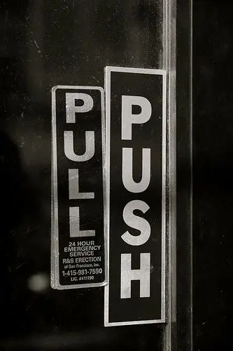
"Do i have to push or pull?"
Uncertainty
Imagine a potential customer visits your website and sees a service listed at $5,000. They spend time thinking about it, decide they’re interested, and finally call you, only to find out the price is now $6,000.
Even if the new price is completely reasonable, the experience doesn’t feel seamless. They came into the conversation because they like whatever they see on the website, and suddenly discovered another in the call. Your website has accidentally created a bottleneck before you’ve even started talking.
Relevancy
Then there’s relevancy. A website can be technically correct and still feel like it belongs to another era. If your website still looks and communicates like it was built in 2015, while your customers’ expectations have moved forward, they may start wondering what’s happening behind the scenes.
Are they still operating? Do they still care about this business? Is this company keeping up?
Look at how businesses communicate today: short-form video, behind-the-scenes content, real photography, personality, founder being present in the video, current projects, people actually showing up on camera.
Then compare that with a website that still looks like a template downloaded from Envato or Themeforest years ago. The problem isn’t that the old template is ugly. It’s that it tells people you’re not “keeping up”..
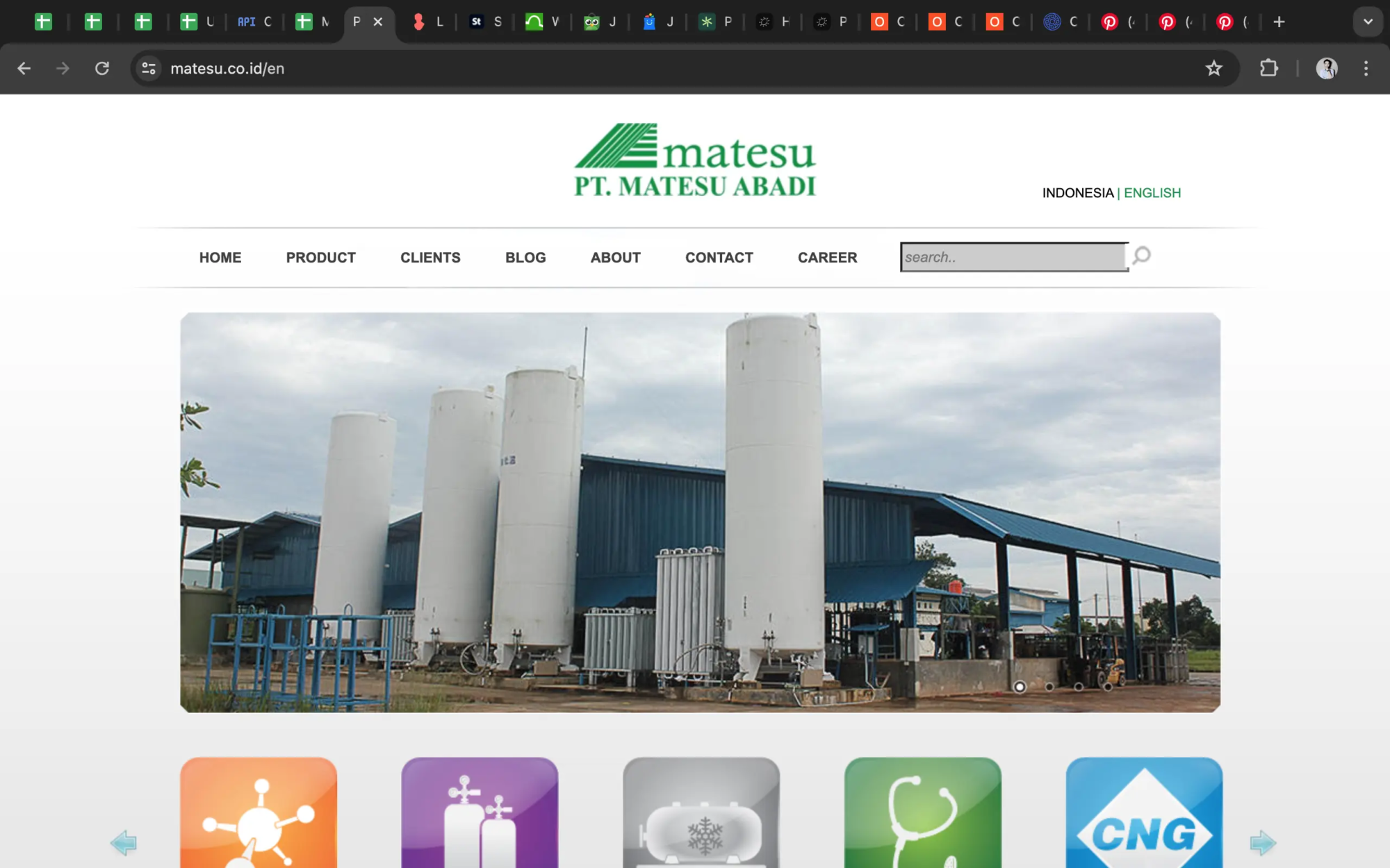
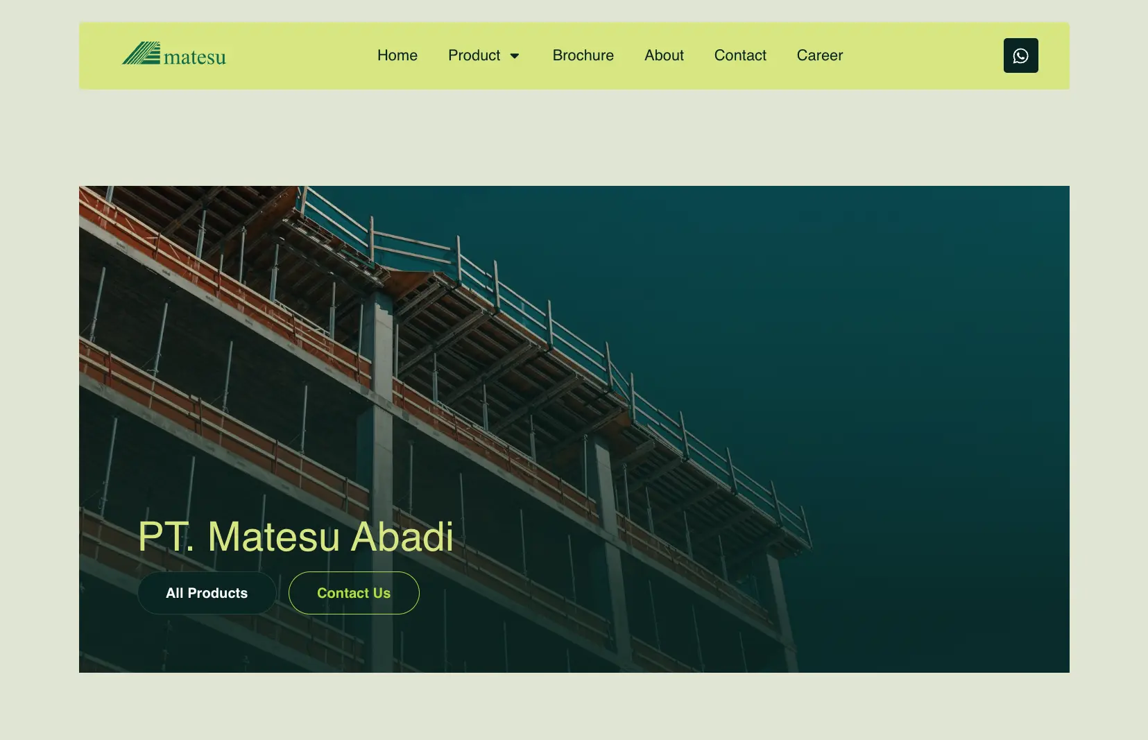
Below is a local company's website. The old vs the new.
The "irrelevant"
The "stay relevant"
4. Difficult navigation makes customers work too hard
Your customer shouldn’t have to solve a puzzle just to understand what you sell. Yet this happens surprisingly often.
Important information is buried two clicks deep, product categories aren’t obvious, services are named in ways you understand but the customers don’t, or the navigation is filled with so many options that it takes seconds for people to decide where to start.
You might know exactly where everything is because you built the website and have looked at it a thousand times. Your customer hasn’t. They’re just some strangers from the internet, and they’re expecting the website to provide the answer they’re browsing for.
The analogy
Think about a physical store. If you ask someone where the shoes are and they say, “Go to the back, turn left, then look for the blue sign behind the display…” you might manage it. But if every part of the store works like that, eventually you’ll wonder if these guys can actually help you at the end.
Websites are no different. Good navigation reduces the amount of thinking your customer has to do. They should be able to understand where they are, where they can go, and what they should look at next without having to figure out your internal way of organizing the business.
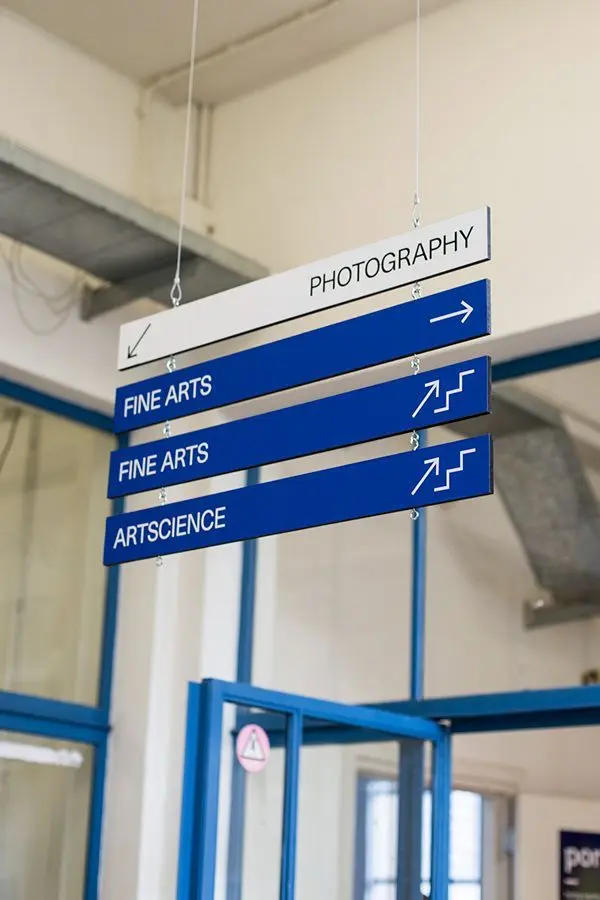
Organizing information through easy-to-understand sign/ menu/ category
This becomes even more important for businesses with a large range of information. If you have 100 products, 20 services, multiple categories, specifications, locations or industries you serve, or problems you tackle, throwing everything into one giant menu isn’t helpful.
A good website doesn’t simply contain information, but it’s easy to browse.
5. A website doesn’t need to be fancy, but it needs to make customers confident
You don’t need flashy animations everywhere, a hundred pages, advanced features, or the latest design trend just to have a website that works for the business.
What matters is whether your website gives the right customer enough confidence to take the next step.
Can they understand what you do? Can they find what they’re looking for? Does the information feel current? Does the business feel relevant to them? Looks legitimate and worth contacting?
That’s really what good web design should do: remove doubt, not add decoration.
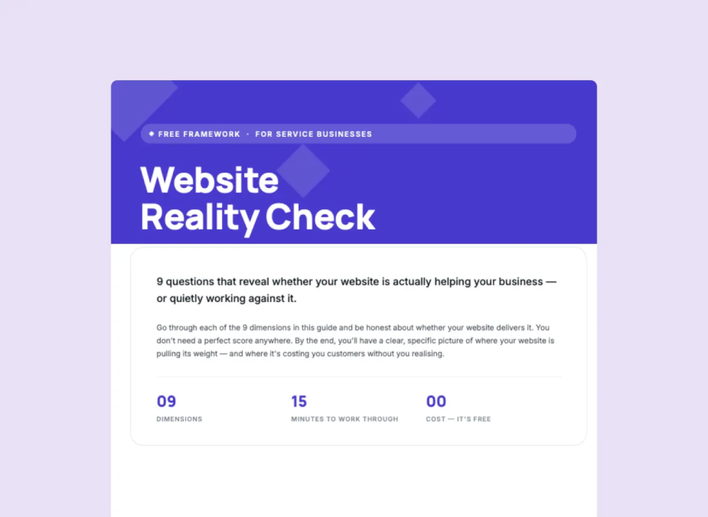
And if you’re wondering whether your own website is doing that job, I’ve put together a long-detailed set of questions you can use to review it yourself.
But here’s the short version:
Dimension 1: Confidence
Confidence is the feeling that a visitor can safely believe in, trust, and feel comfortable choosing your business. It is built through the overall experience. Not one testimonial, one badge, or one polished photo.
A website can contain plenty of trust signals and still fail to make someone confident if the overall impression, presentation, evidence, and information don't work together.
Review:
Check whether the website builds confidence through:
A clear and appropriate first impression
A first impression that matches how you want the business to be perceived
A professional appearance that suggests the business is organised and reliable
Consistent branding, visual quality, structure, and presentation
Clear, accurate, well-written, and up-to-date information
An experience that feels considered rather than improvised or neglected
Evidence that the business is capable of delivering what it promises
Relevant experience, qualifications, certifications, awards, case studies, portfolio, results, or industry knowledge
Evidence appropriate to the type and value of service being offered
Real customer experiences through testimonials, reviews, ratings, client logos, success stories, or other social proof
Authority through useful content, original insights, publications, partnerships, research, frameworks, or demonstrated expertise
Enough information for visitors to understand how the business works
Clear process, timelines, deliverables, expectations, limitations, and FAQs
Easy-to-find contact and business information
Authentic photography, writing, stories, values, or other elements that make the business feel genuine
Relevant reviews, associations, awards, publications, profiles, references, or community involvement
Clear answers to the risks or concerns that could make someone hesitate
No obvious inconsistencies between what the business claims and what the website actually presents
.
Key thinking:
If a potential customer had never heard of your business before, would this website give them enough confidence to seriously consider working with you?
Already too long
The list above is just 3 parts of the Dimension 1. I'll guide you through the other 9 dimensions (each will have 10 parts on avg.).
Dimension 2: Communication
Communication is how effectively your website helps potential customers understand what you do, who you do it for, why they should care, what they can expect, and what they should do next.
Good communication isn't just about having a clear copy. The message needs to work as a whole. From the first headline through your services, benefits, proof, content, and calls to action.
Review:
Check whether the website clearly communicates:
The problem you solve
Who you help
The value you provide
Why that value matters
Why someone should choose you
What the business actually does
The main message you want visitors to remember
A consistent story across pages
Your market position
Your target customer
Your specialisation
Your unique approach
Whether you're positioned appropriately in the market
Who the service is and isn't suitable for
Services and offerings
Service descriptions
Scope and deliverables
Pricing explanation if needed
Package structure and naming
Enough detail for customers to understand what they're getting
Clear, simple, concise copy
Copy that helps visitors make decisions (to click a button)
Consistent terminology and messaging
Appropriate tone of voice
Content that answers real customer questions
Accurate, relevant, useful, original, and sufficiently detailed content
Information presented in an order that makes sense to the visitor
Clear headings and content hierarchy
Readable paragraphs, typography, spacing, and formatting
Visuals that support rather than contradict the message
.
Key thinking:
You may have them all or some, but the key is: do they clearly communicate the message you want people to get?
Download the full list on my Web Reality Check (PDF)
Will be sent to you
Could not be saved. Please try again.
You're good! Please check your inbox now (or spam folder)